
| Aspect | Description |
|---|---|
| Core Symbol | Interlocking “S” and “Q” letters within a circular frame. |
| Color Palette | Dominant metallic silver, often paired with black or white backgrounds for high contrast. |
| Typography | Bold, sans-serif, uppercase “SHACMAN” wordmark, conveying stability and power. |
| Primary Meaning | Represents “Shaanqi” (company’s Chinese name origin) and “Success with Quality”. |
| Visual Metaphor | The interlocked letters subtly mimic a steering wheel, symbolizing control and forward motion. |
| Application | Embossed on vehicle grilles, printed on manuals, used in digital and physical marketing. |
The brilliance of the SHACMAN logo lies in its layered symbolism. The emblem is a sophisticated composition of the letters “S” and “Q”. These letters carry dual significance that connects the brand’s past to its present vision.
First, they are the initials of the company’s original Chinese name, “Shaanqi” (陕汽), proudly reflecting its roots in Shaanxi Province, China. This grounds the brand in a rich manufacturing heritage. Second, and more profoundly, they stand for the brand’s global motto: “SHACMAN Quality” and the driving principle of “Success with Quality”.
This dual meaning seamlessly merges local identity with international ambition. The visual execution is equally thoughtful. The “SQ” pattern is not merely typed out; it is artistically interlocked and stylized to resemble the shape of a steering wheel.
This clever metaphor speaks directly to the company’s core business of building world-class vehicles. It symbolizes control, precision engineering, and the relentless pursuit of excellence on every road, everywhere. Every glance at this logo reinforces the promise of dependable performance.
The interlocked “SQ” design is highly distinctive. It creates a unique visual hook that is easily recognized and remembered in the crowded automotive landscape.
The clean, geometric forms of the logo ensure it remains clear and impactful at any size. It works perfectly on a massive truck grille or a small mobile app icon.
It instantly communicates core brand attributes: strength (through bold form), quality (through metallic finish), and innovation (through clever symbolism).
Avoiding fleeting design trends, the logo’s classic circular badge and letter-based design grant it longevity, ensuring it remains effective for decades.
The strategic design of the SHACMAN logo directly supports brand loyalty and market positioning. Its professional appearance builds trust with commercial clients who value reliability. The emblem’s aesthetic coherence across all products strengthens brand unity. It tells a consistent story of rugged capability and sophisticated engineering. This powerful visual asset is a cornerstone of SHACMAN’s global marketing success.
The visual language defined by the SHACMAN logo extends powerfully across all applications. Its consistent use creates a strong, unified brand presence that is instantly identifiable worldwide. The metallic emblem catches the light on vehicle grilles, projecting an image of premium build quality. In print and digital media, the high-contrast logo commands attention and conveys authority. This section showcases the logo’s adaptability and visual impact in various contexts.
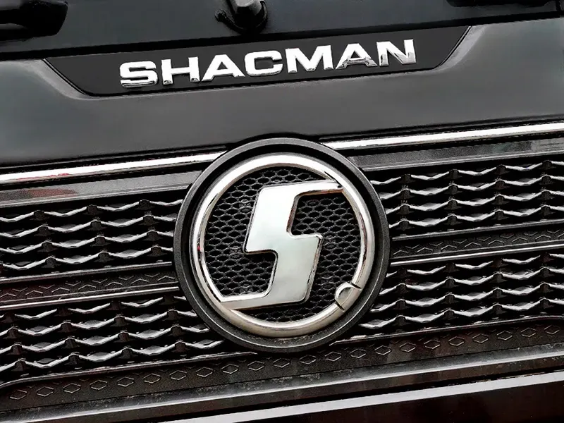
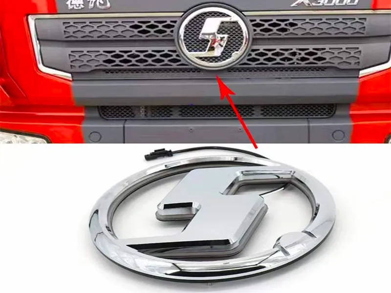

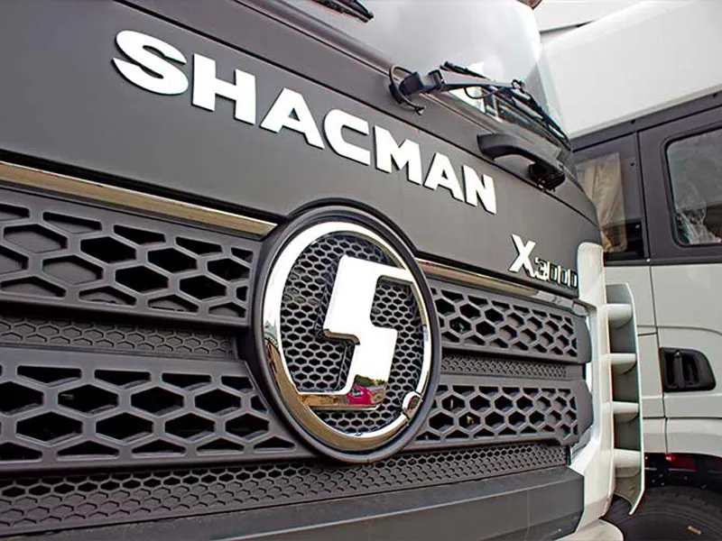
The repetitive use in this grid demonstrates the logo’s consistent core identity. In real-world use, these would be varied applications like truck fronts, dealership signs, uniforms, and official merchandise. Each application reinforces the same message of strength and reliability. The visual weight of the logo ensures it is never overlooked.
The SHACMAN logo is not a standalone graphic. It is the visual summary of a 50-year journey in heavy-duty vehicle manufacturing. This heritage is embedded in its very design. The choice of a solid, circular badge echoes the robustness of the trucks themselves. The metallic silver finish is a nod to the steel and advanced alloys used in construction.
Every time the logo is seen, it subconsciously communicates this legacy of experience. It tells a story of countless miles traveled, challenging terrains conquered, and engineering problems solved. This deep-rooted history provides a competitive edge. It builds a foundation of trust that new brands cannot replicate.
Customers associate the logo with a proven track record. The logo acts as a seal of approval from decades of industry presence. It is a badge of honor worn by vehicles known for their endurance. This connection between visual identity and tangible performance is priceless.
In today’s global market, a strong visual identity is crucial. The SHACMAN logo serves as a universal symbol. It transcends language barriers. A customer in Asia, Africa, or Europe instantly recognizes the brand by its emblem. This global recognition is a direct result of consistent and strategic logo application.
The logo’s design avoids cultural-specific imagery. This allows it to resonate across diverse markets. The focus on abstract letters and universal symbols of quality (the circle, metal) makes it internationally accessible. It projects a modern, world-class image.
It assures potential buyers of international standards and support. The logo is a key asset in SHACMAN’s expansion strategy. It creates a cohesive brand experience worldwide. This strengthens the company’s position as a major player in the international commercial vehicle arena.
The SHACMAN logo is a masterclass in effective corporate identity design. It successfully condenses a complex story of heritage, quality, engineering, and global ambition into a single, powerful, and elegant mark. From its meaningful “SQ” core to its versatile visual application, every aspect is engineered for impact. It is more than just a logo; it is the face of reliability on highways across the globe. It inspires confidence in drivers and fleet managers alike. This iconic emblem is truly the driving force behind a legendary brand’s visual identity.
We have explored the intricate details, symbolism, and powerful advantages of this remarkable brand symbol.
Learn More